Using First Click Testing to Improve UX for TeamPassword Mobile
Table of Contents
This past July, we released the first-ever mobile app for TeamPassword customers. After working for almost a year to design and develop this app, we have many lessons learned and want to share a bit of how we worked to make TeamPassword Mobile a useful, easy-to-navigate app for our users.
As we designed this app, we used many different UX research methods to stay aware of our users’ needs and evaluate the effectiveness of our designs. For this initial release, it was very important to make a good first impression, and show our customers how much we value their experience. We also wanted to lay a strong design foundation, to support us as we grow and build out our roadmap of new features.
One of the research methods we used is called a First Click Test. This method is great for small, agile teams who need to work fast, but still want to follow a design thinking process and continuously evaluate and iterate their designs. This is a particularly useful method for evaluating navigation, as research has shown that:
- “A participant who clicks down the right path on the first click will complete their task successfully 87% of the time.
- A participant who clicks down the wrong-path on the first click, tends to only successfully complete their task 46% of the time.” - Usability.gov
In a First-Click Test, participants are presented with a single screen, functional or prototype, and given a prompt asking them where they would click (or in our case, tap) to perform a certain task.
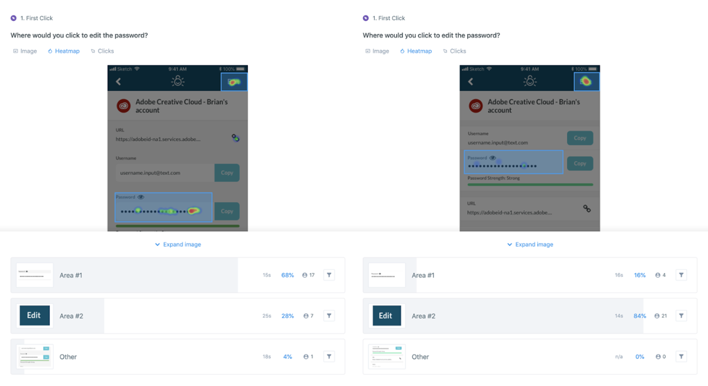
We had learned from usability tests that a particular place in our design was confusing users. The screen to view a login had a white, rounded box containing the username and password, and our test participants frequently attempted to tap this box to edit the password. In hindsight, this design clearly implied that the box was a form field... because it looks just like a form field. But this is the beauty of usability tests — when you are working fast and your team is small, it is easy to miss what may seem obvious. When you put your designs in front of real users, you save yourself the time and investment of having to go back and fix these forehead-smacking issues later!
We iterated the design of this screen in an attempt to fix this problem, and came up with what we believed to be a major improvement. However, we didn’t want to make the mistake of assuming our design would solve the problem. Before we did any development work, we did a First Click Test to validate it.
There are a lot of tools out there to conduct a First Click Test remotely, many that offer a panel of users you can easily recruit from using demographic filters and screener questions. We used a service called UsabilityHub.
For our test, we simply conducted two versions: one with the current screen and one with the new design, and asked, “Where would you click to edit the password?” We had a total of 50 participants respond, 25 for each version, and we were able to get results within a couple of hours.
We found that the new design not only increased the number of people tapping the right spot by 56 percentage points, but also the time it took people to decide on the correct answer was decreased by 44%, from 25 seconds to 14 seconds. This told us that the interaction was not only more clear, but much more intuitive, requiring less cognitive effort to figure out.
At this point, we were able to confidently move forward with development knowing the new design would be an improved experience for our users.
We have a lot of big plans for TeamPassword Mobile, and are so excited to continue using this and other methods to stay aware of what our users want and need from a password manager.
Enhance your password security
The best software to generate and have your passwords managed correctly.

